I'm working on a new Saas and decided to use some new tech that I haven't used before, specifically Svelte & Tailwind. More details on that Saas are found in another recent post, but I just wrapped up building an interactive modal from scratch and figured I'd share how I did it.
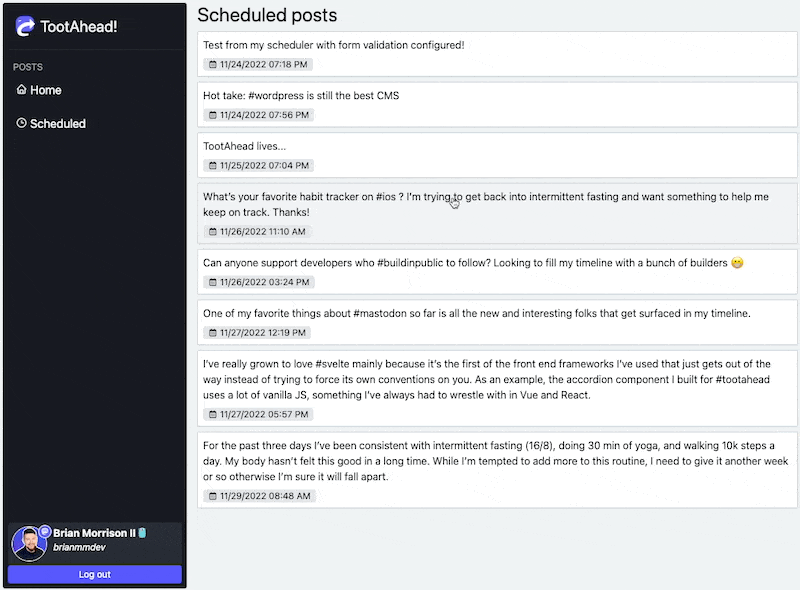
Here is the end result:
I'm going to make this a bit more generic than my use case. I started by creating a component that used a if block to check if the prop open is true or not to display the modal. I also used the transition prop on the main div to apply the smooth animation as it is rendered/removed. The Tailwind classes applied will make this div take up the entire screen, and center any content within.
<script lang="ts">
  import { sineIn } from "svelte/easing";
  import { fade } from "svelte/transition";

  export let open: boolean
</script>

{#if open}
  <div transition:fade={{ duration: 150, easing: sineIn }}
    class="absolute top-0 bottom-0 left-0 right-0 grid justify-center items-center">

  </div>
{/if}
Next I'll add some content so when the modal is open, there is actually something on the screen. Here is a breakdown of the important Tailwind classes:
relative- Keeps this div with the parent, since the parent isabsolute.w-screen sm:w-[80vw] sm:max-w-[800px]- Makes the div take up the full width of the screen, UNLESS its at or above thesmbreakpoint, by which it will take up 80% of the screen width up to a max of 800px.h-screen sm:h-auto- Similar to above, take up the full height of the screen, or only as much as needed if at thesmbreakpoint or above
<script lang="ts">
  import { sineIn } from "svelte/easing";
  import { fade } from "svelte/transition";

  export let open: boolean
</script>

{#if open}
  <div transition:fade={{ duration: 150, easing: sineIn }}
    class="absolute top-0 bottom-0 left-0 right-0 grid justify-center items-center">
    <div class="relative rounded shadow-sm w-screen sm:w-[80vw] sm:max-w-[800px] h-screen sm:h-auto bg-bglight" style="z-index: 1000;">
      Main content goes here!
    </div>
  </div>
{/if}
Now instead of adding a background to the top-most container, I needed to create a secondary div that was clickable so when the user clicks on the backdrop, it will close the modal. I also added the onClose prop so my modal can signal to the parent when that backdrop is clicked. The z-index values are important between the backdrop and the main content. Since the content div has a higher z-index value than the backdrop, it will visually be placed on top of the backdrop.
<script lang="ts">
  import { sineIn } from "svelte/easing";
  import { fade } from "svelte/transition";

  export let open: boolean
  export let onClose: Function
</script>

{#if open}
  <div transition:fade={{ duration: 150, easing: sineIn }}
    class="absolute top-0 bottom-0 left-0 right-0 grid justify-center items-center">
    <div on:click={() => onClose()} class="absolute top-0 bottom-0 left-0 right-0 bg-gray-900/90" style="z-index: 100;" />
    <div class="relative rounded shadow-sm w-screen sm:w-[80vw] sm:max-w-[800px] h-screen sm:h-auto bg-bglight" style="z-index: 1000;">
      Main content goes here!
    </div>
  </div>
{/if}
Finally, the parent component that is using the modal should have a prop that signals whether the modal is open or not, as well as the onClose wired up to set that value to false:
<script lang="ts">
  import Modal from "./Modal.svelte";
  let isModalOpen: boolean = false;
</script>

<div>
  <Modal open={isModalOpen} onClose={() => isModalOpen = false} />
</div>
Finito!